
Cafeteria website case study
Case study: Part of my Google UX Design Professional Certificate program.
2022
Project overview
The product:
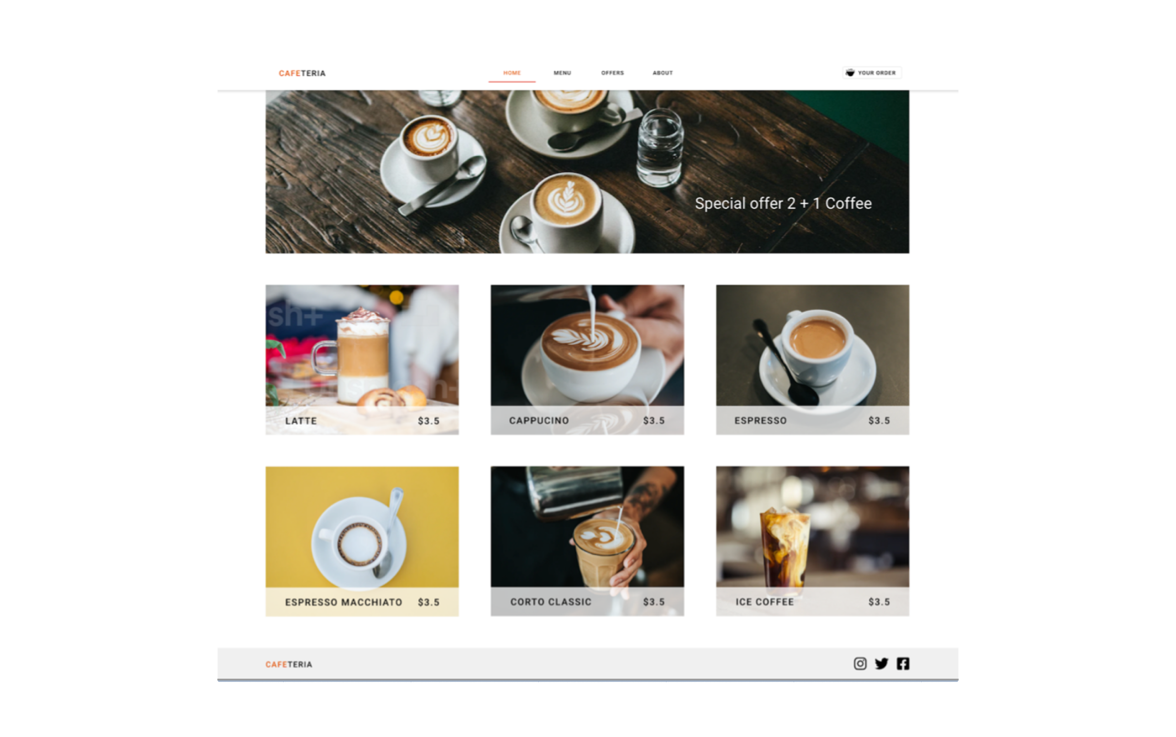
The website is designed to enhance the cafeteria experience and make it easier for people to order coffee.
My role:
UX researcher, UX designer, UI designer
The problem:
People don’t want to lose their seats based on their order. In some cases, people want to sit and order from their place to keep their place in the cafeteria.
Responsibilities:
user research, wireframing, prototyping, designing
The goal:
Create a website that will allow browsing the menu, creating an order, and selecting a table in the cafeteria.
Project duration:
December 2022
Understanding the user
User research: Summary
I conducted user interviews and created empathy maps to understand the users. A primary user group identified through user research was working adults in the office who want to enjoy coffee.
This user group revealed problems like delivery/pickup – coffee could be cold, and some customers want to sit and enjoy the coffee.
User research: Pain points
1.
Pickup
Not picked up in time, and coffee could be cold.
2.
Ordering in place
Why use an app in the cafeteria to order a coffee?
3.
Accessibility
Missing assistive technologies.
Persona: Tom

User journey map
Mapping Tom’s user journey revealed how he can order a coffee from his place in the cafeteria.

Problem statement
Mapping Tom’s user journey revealed how he can order a coffee from his place in the cafeteria.

Starting the design
Paper wireframes


Low-fidelity prototype

Usability study: Parameters
Study type:
Unmoderated usability study
Location:
Prague, remote
Participants:
5 participants
Length:
20-30 minutes
Usability study: Findings
1.
Users want to order more types of coffee.
2.
Users want more information about picking a table.
3.
Missing information about the table in the summary.
Refining the design
Mockups

Mockups: Original screen sizes

Mockups: Screen size variations

Accessibility considerations
1
Users want more information about the table. I used table images and added more descriptions about the place.
2
Users want information about the picked table on the summary page. I added this information to the overview.
Going forward
Takeaways
Impact:
The number of visitors is double what we expected.
What I learned:
I learned that doing a usability study multiple times is very useful.