
CAFETERIA MOBILE APP CASE STUDY
Project overview
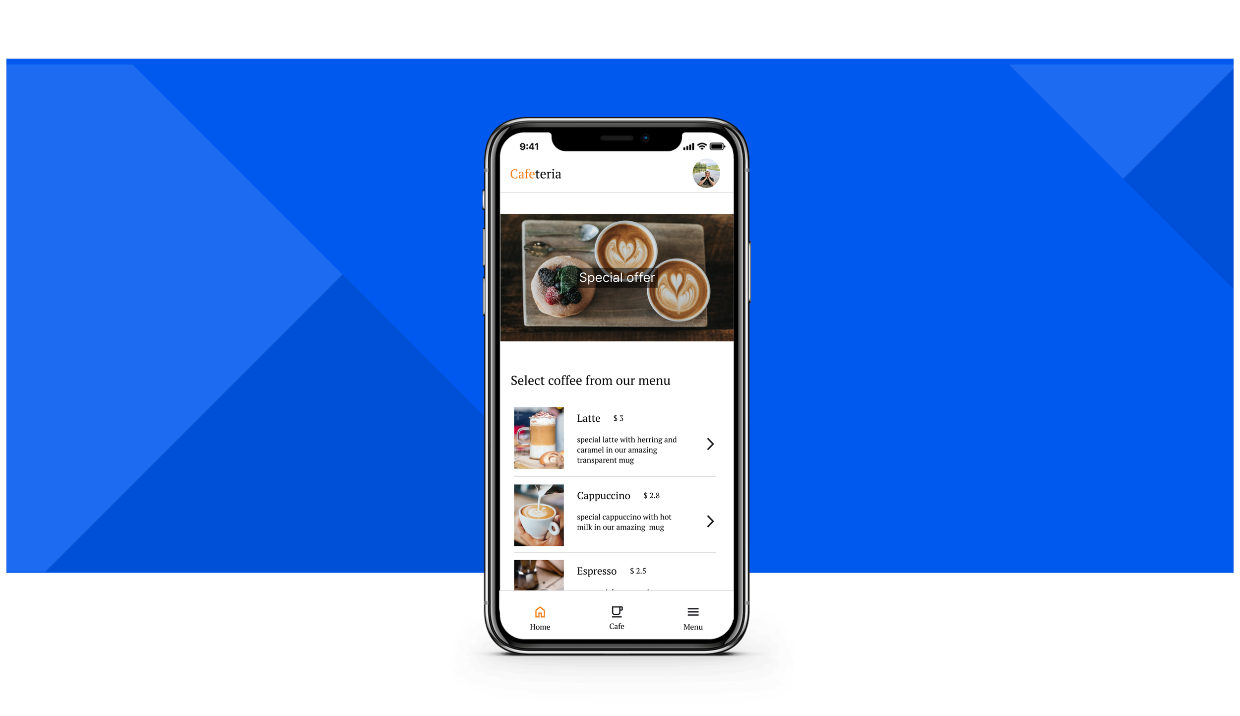
The product:
The application is for a better experience in the cafeteria and should help people to order coffee.
The problem:
People don’t want to lose their seats based on their orders. Sometimes, people want to sit and order from their place to keep this place in the cafeteria.
The goal:
Create an app that will allow you to browse the menu, create an order, and select the table in the cafeteria.
My role:
UX researcher, UX designer, UI designer
Project duration:
September 2022 – December 2022
Responsibilities:
user research, wireframing, prototyping, designing
Understanding the user
User research: Summary
I conducted user interviews and created empathy maps to understand the users. A primary user group identified through user research was working adults in the office who want to enjoy coffee.
This user group revealed problems like delivery/pickup – coffee could be cold, and some customers want to sit and enjoy the coffee.
User research: Pain points
1.
Pickup
Not picked up in time, and coffee could be cold.
2.
Ordering in place
Why use an app in the cafeteria to order a coffee?
3.
Accessibility
Missing assistive technologies.
Persona: Tom

User journey map
Mapping Tom’s user journey revealed how he could order a coffee from his place in the cafeteria.

Problem statement
Mapping Tom’s user journey revealed how he could order a coffee from his place in the cafeteria.

Paper wireframes
My sketches for the application.
Starting the design

Digital wireframes

Low-fidelity prototype
Low-fidelity prototype with ordering scenario is available here:

Usability study: Findings
Round 1 findings
1. Users want more languages
2. Users want order more types of coffees
3. User want more information about picking table

Round 2 findings
1. Missing information about table in summary
2. Missing table information in the summary page
Mockups
REFINING THE DESIGN


High-fidelity prototype
The final high-fidelity prototype is done and available on this link:

Accessibility considerations
1
Users want more information about the table. I used images of what the table looks like and added more descriptions about the place.
2
Users want information about the picked table on the summary page. I added this information to the overview.
Takeaways
GOING FORWARD
Impact:
The number of downloads is doubled than what we expected.
What I learned:
I learned that doing a usability study multiple times is very useful.